The Physical and the Virtual: How Our Practices Are Changing
Setting the right design plan for your dental office boosts digital workflows in ways that can make the patient and practitioner happy.
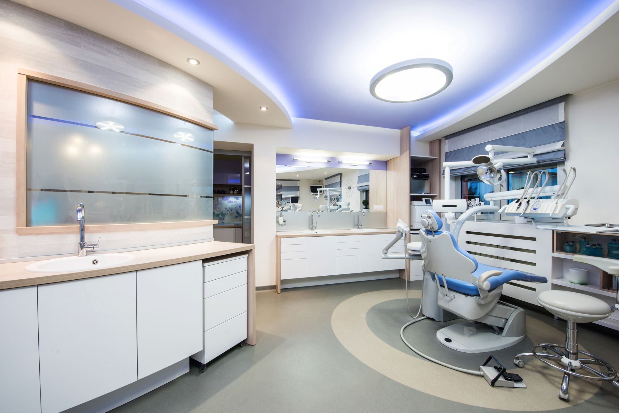
The Physical and the Virtual: How Our Practices Are Changing. Photo courtesy of poplasen/stock.adobe.com.

I am a huge believer in going back to go forward. I know that to many of you, that probably seems like a weird dichotomy—and it is. However, give me a chance to explain myself.
For this month’s column, we need to get in “The Wayback Machine.” Now we have even more confusion here because for many of you who have grown up in the digital age, that phrase means the digital internet archive of the World Wide Web. But for some of us who are just a tad older, it conjures images of the cartoon series Peabody’s Improbable History. Sherman and Peabody would use The Wayback Machine to travel back in time to teach viewers about history. I won’t bore you with tales of how awesome Sherman and Peabody were (and trust me, they were awesome). Just go to YouTube, search for them, and you can see just what I mean.
In the Beginning
For this month’s column, The Wayback Machine will deposit us in the decade of the 1950s. The reason? In the mid-1990s, a friend of mine decided to strike out on his own and purchased the practice of a retiring doctor in a suburb of the greater Kansas City area. He was really excited about it and invited me over to see the office.
What I found when I got there was a house on the edge of a sleepy suburban neighborhood. All the houses in the neighborhood had been built in the post–World War II housing boom and were small ranch floor plans surrounded by small green yards and gigantic leafy oak trees towering over them. Other than the unobtrusive sign in the front yard with the practice name, it was impossible to tell the building wasn’t just another home.
Opening the front door, you entered a reception room that would have been the living room in the residence. There was a small front office/business area with a sliding-glass partition and a door that opened into the rest of the space. The clinical portion consisted of 3 tiny operatories and another small room that was the doctor’s private office.
The hallway to the operatories and the office was so narrow that no one could pass each other without turning, pressing their back against the wall, and shuffling sideways until they were again in the clear. The place looked like the office of Doctor Ward Cleaver. I kept expecting Barbara Billingsley to round the corner with a plate of cookies the entire time I was there.
My friend knew he couldn’t stay there. He knew what a successful office looked like—and it wasn’t this.
Design and the Continuous Process of Evolution
I started in a suburban strip mall in an office that was a long, deep rectangle. It was 1400 square feet, and the only windows were in the reception room. It felt like working in a coal mine. It was laid out in a way to accommodate 4 operatories, but I only ever set up 3 because I had no idea where I would have stored my supplies. I moved out of that space after 18 years. I purchased land and began construction on a freestanding building.
It’s funny. I moved from 1400 square feet into a building with 4300 square feet. I couldn’t believe how big that office was as I walked through it the first few days seeing patients. Now I wish I would have built it bigger.
The truly amazing thing to me is that the first office was state of the art when it was built. We keep learning and changing and growing as time passes, and we keep making improvements to make things better.
The Pods Concept
My office is built on what I call a “pod” design. There is a reception/business pod, a clinical pod, and a staff pod. Each pod seals with doors, which provides for separate ambience and for containing the sounds of that pod. Although I think the open, airy, and interconnected concept of architectural design has some merits, every plus has a minus. There are times in any business when you need some isolation or simply some privacy. We attempted to create 3 open and airy concepts while isolating them from each other to create the best of both worlds, and I like to think we succeeded. One additional and unintended benefit was when we returned from the COVID-19 shutdown in May 2020, our clinical pod was already separated from the other parts of the office, helping decrease patient concerns about viral spread.
Reception Pod
In the reception/business pod, it is quiet and peaceful. There is no sound of handpieces or the occasional crying child to be heard by waiting patients or the caller on the phone. The music is relaxing, there is a digital check-in area, and the flat-screen TVs in the seating area provide information on dentistry and the practice. Large windows let in lots of natural light, and because the office sits on a lot that is 1¼ acres, we don’t have other buildings obstructing the views. Even though we are in suburbia, it doesn’t appear crowded.
We also intentionally made the reception pod big with high ceilings that complement the windows and the feel. There is enough room that even on occasions when patients might be sitting, they have room and aren’t forced to sit close to one another. This keeps the stress level down in folks, and as we all know, many people feel stressful enough about dentistry.
Also, 2 doors lead into the clinical pod, so there is never a traffic jam and patients aren’t in each other’s way.
Clinical Pod
The clinical pod focuses on clinical care. There are no ringing phones, and each operatory can provide video or music to suit the patient’s needs. There are a lot of windows, which open to allow fresh air to circulate through the pod. Sunshine abounds. The windows look out on to a wooded area, where we can see deer, foxes, and the occasional groundhog. Under the concrete slab floor, 2-in conduit is in place that allows for any type of cabling to be run from one end of the pod to the other. My principle operatory also features a video line that runs to the conference room to allow me to directly broadcast clinical procedures there for anyone who wants to watch.
The clinical pod also has a lab room, but we kept it small. At the time of construction, I knew dentistry was headed to digital and virtual prosthetic fabrication, so I didn’t want to invest square footage and expense in creating a large room for laboratory work when I knew most of it would soon be done on a screen. We pour an occasional model there, but almost anything requiring lab work is done virtually these days.
Staff Pod
The third pod is the staff pod. In my original 1400-square-foot office, my personal office was directly next to one of the treatment areas and I never felt I could ever get away from the pressure. Even when I closed my door, I could still hear everything that was going on.
When I designed the new office, I wanted an oasis for me and my team. The staff pod has doors that are always closed. The lighting is more subdued. There is a kitchen, a staff restroom, staff lockers, laundry, doctors’ offices, and the conference room. The staff pod has no sounds of handpieces or dentistry of any kind.
When the door closes behind you, the environment is totally different. You can breathe and relax, if only for a few minutes.
Our conference room has become a bit of the “digital lab” portion of the office. In addition to all the standard conference room amenities one would expect, we also have our design computers, mills, 3D printers, wash stations for printed models, and more.
The interesting thing about our digital lab is that the team feels that designing and creating in more of an office environment and in less of a dental lab environment are much more conducive to creativity and concentration and aid greatly in our digital workflow.
Digital Workflow
When we designed the space, we had to try to envision what things would look like in the future. The best part of all this is the ease that comes with the digital workflow. One of the buzz phrases that the staff and I use with each other is, “it’s just electrons,” and by that we mean that because our clinical data are digitized, we can move them and/or work with them anywhere we desire.
Our intraoral scanners send their information to the cloud, where we can then download it for use in-house or send it securely to anyone who needs it, be it specialist or lab. We can use the scans to design and mill restorations in-house for efficiency and cost savings. We can 3D print models. We can design and print or mill surgical guides, occlusal guards, or whitening trays.
Wrapping Up
The way we now handle patient workflows in our offices has changed dramatically in the past 50 to 60 years, and patient expectations regarding office design have changed too. In the early days of technology in health care, patients were more accepting of cords running all over and less-than-ideal office esthetics as we attempted to shoehorn our computers and other hardware into the clinical workspace.
Now our offices have become technology hubs where we create massive amounts of digital data every day in workspaces that are designed for that purpose. I don’t think dentistry has ever been more fun, and I love the fact that the quality just keeps getting better. The only thing we know for sure is that change is constant. However, make sure you enjoy the ride. Tomorrow will be even more fun, I’m confident of that.
