Making critical office design decisions
How to design a practice with proper function and flow.

Like so many young dentists, I bought an older practice from a dentist nearing retirement. It was a two-chair office with very old equipment. I was so excited to get in there and work in my own office. I then quickly learned only one of the two chairs worked, and the “working” one had a finicky delivery system that tended to break down every few days. It was a steep learning curve.
I was ready to get this office going though, so after only a couple months, I renovated. I changed the large doctor’s office into a hygiene room with a tiny little corner for a break room/office. We did our best with the space available, but after a few years working in this space, there are many things I wished were different.
I’m now designing a new building to expand into. I’m trying to take the lessons I’ve learned in my less-than-ideal space and combine them with advice from experts in the field to create an office that will have great function and flow.
Every design decision I make needs to be evaluated from multiple viewpoints: Is there room for the elements we need (technology, instruments, etc.)? How are the ergonomics?
Read more: The virtues of beautiful design
Are we making extra movements? Are things conveniently available, or are we wasting time running for things? Are we spending extra money on supplies and duplicating things unnecessarily?
I approach this design from a place of comparison to my old office. We had to find room to put computers in each operatory. It made for some tight and awkward layouts and a lot of cords.
Technology is a prime consideration going into this new space. There’s so much available now, and in the future, there’s only going to be more and it will likely and hopefully be smaller and more convenient.
I’m making sure to have screens available behind the patient for us to look at the schedule and images if needed as well as in front of the patient for better communication. Also, this will provide a screen for me to put radiographs on to look at while working without turning around-I want to preserve my neck and back after all!
That’s just the base. From there, I’m looking at the most convenient place to put the intraoral camera. In the future, I plan to have an intraoral scanner. It’s important to consider how that will be able to plug in. Where are the USB ports? We’re currently using iPads for patient education videos and entertainment, and as practice management software progresses, I look forward to being able to use convenient tablets for more functions.
Storage has been a big issue for us. We’re in an approximately 900-square-foot building, so cupboards are limited and very inconvenient. I can’t tell you how many times I’ve asked for something that’s rarely used and it seems to have disappeared into the ether. Our awkward cupboards have taken another victim!

One of the things I’m looking forward to with moving is seeing all of the random items we find in the nooks and crannies. In the new office, we’ve decided to have very little storage in the operatories and to keep it centralized, as we were taught by Design Ergonomics.
Fewer cupboards we rarely open means less stuff lost. It also means fewer supplies sitting there gathering dust as well as better ergonomics for my assistants. The assistants won’t be digging in cupboards in the operatory. Instead, they’ll have everything in a centralized location, and they’ll be trained to be ready with what’s needed for the appointment.
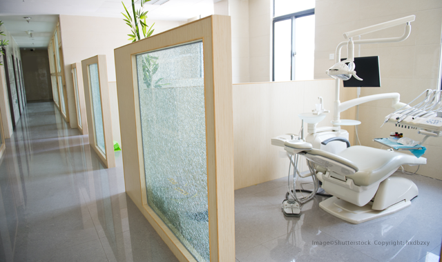
I’ve decided to keep our operatories simple; clean lines, less clutter. Everything we need will be at hand. We’re trying to limit the range of motion both for myself and for my assistants.
Trending article: The top 10 best cities for dentists in 2019
Right now, my poor assistants have to turn to grab things that are all the way behind them because that’s the only available space to set things down. Then, they have to lunge over to the other surface and try to find a way to get to the mouth without getting tangled on all the hoses by their feet. I doubt they realized assisting was a job involving gymnastic skills when they started.
I’m hoping to eliminate that as much as possible with our new operatories. By keeping things at the head of the patient and not having items where they can’t reach them, I hope to make their jobs much easier.
We currently have one large room with a divider and it makes for an awkward entrance. I’m looking forward to having dual-entrance operatories. Both the assistant and I will then be able to come and go as needed without bumping into everything.
I have no doubt during this design process I’m going to change my mind many more times. Even when I get the rooms the way I think is best, I’m sure to learn something down the road that makes me wish I had done it differently. New technologies will emerge I didn’t anticipate and things will change. But isn’t that part of the fun of dentistry?

ACTIVA BioACTIVE Bulk Flow Marks Pulpdent’s First Major Product Release in 4 Years
December 12th 2024Next-generation bulk-fill dental restorative raises the standard of care for bulk-fill procedures by providing natural remineralization support, while also overcoming current bulk-fill limitations.